The statements by the United Nations Intergovernmental Panel on Climate Change (IPCC)REF on the detection and attribution of climate change have convinced many that there has been unprecedented global warming since at least the mid-20th century and that this is mostly caused by humans. For example, the IPCC argues that:
- “It is extremely likely that human influence has been the dominant cause of the observed warming since the mid-20th century.”REF
- “The dominant role of humans in driving recent climate change is clear.”REF
- “It is unequivocal that human influence has warmed the atmosphere, ocean and land.”REF
In this report, we will explain some of the methods used to arrive at these conclusions. We will show how these procedures are problematic and will demonstrate that other reasonable methods and procedures can produce different conclusions about the detection and attribution of climate change. We discuss and explain in detail the twin problems in the IPCC’s poor choice of temperature dataset and solar forcing record. We therefore challenge the IPCC’s scientifically weak conclusion. We hope that the evidence in this report will demonstrate to the reader that the IPCC’s statements on the detection and attribution of climate change are at best overconfident and premature.
First, we will discuss the methods used to detect climate change and the limitations of these methods. Second, we will examine the procedures the IPCC has used to attribute this climate change to humans. Finally, we will show how the IPCC’s approach was flawed and that it is still unclear whether the warming since the industrial revolution is “mostly natural,” “both natural and human-caused,” or “mostly human-caused.”
“World’s Global Temperature” and How It Is Determined
When The New York Times makes claims such as “2023 Shattered Records to Become the Hottest Year,”REF where do these claims come from, and how do the authors know that they are true? To answer these questions, one needs to know what is meant by the world’s global temperature and how it is determined.
Since the early 20th century, the principal data used in studying global temperature changes have been the temperature data recorded at weather stations around the world. In recent decades, other types of data such as sea surface temperatures (from ships, buoys, etc.) or satellite and weather balloon measurements have been used, but original weather station data remain the most popular form of data.
We know from our own experiences that temperatures change all over the world from morning to night, day to day, season to season, and place to place. How do we take this vast range of temperatures and turn it into a global temperature for a given year? Text Box 1 outlines the main steps taken to calculate a global temperature time series (or an average global temperature measurement).
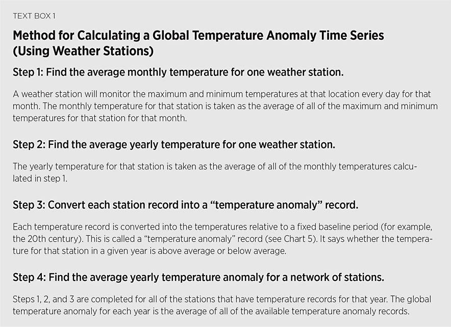
Although the method used to calculate the average global temperature for a given year as described in Text Box 1 may sound sensible and logical, there are several problems with this procedure that can result in an inaccurate global temperature measurement.
The first problem has to do with the distribution of stations in the network. When the average yearly temperatures are being combined to get the world’s global temperature for that year, there are many ways to combine these station records.
A common approach is to use a “gridded average”REF in which the world is divided into many small grid boxes based on small increments of longitude and latitude. If there is only one station in the grid, then its yearly temperature record is taken as the temperature for that grid. If there is more than one station in the grid, then an average of the multiple measurements is taken for that grid. However, the number and locations of the stations within these grids vary greatly from year to year. Therefore, although a research group may choose to calculate the global temperature using the same procedure, the year-to-year changes in a station network mean that they are not comparing like with like. This can result in inaccuracies when comparing measurements from one year to the next.
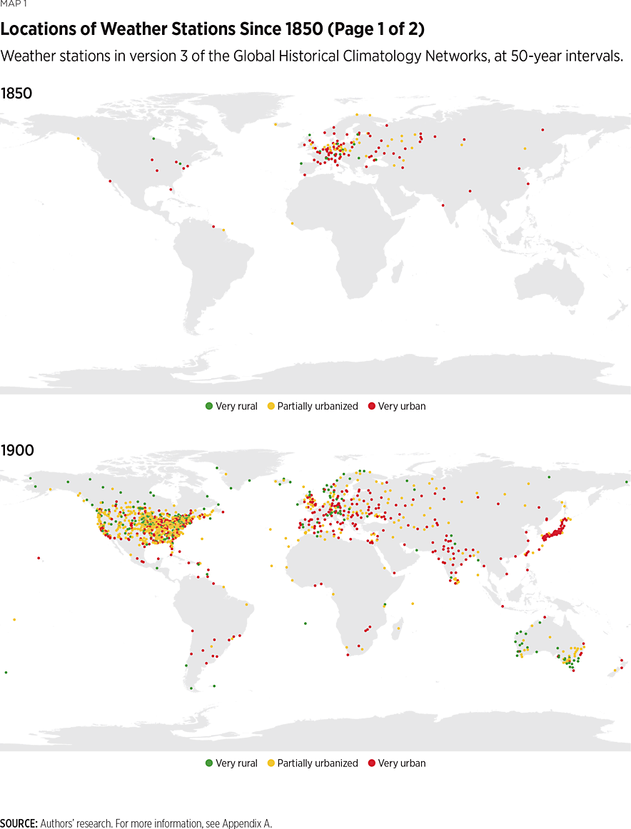
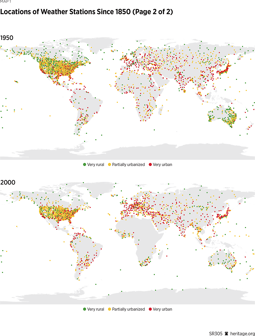
Another problem related to the distribution of weather stations is that whole sections of the globe are neglected. Up until the 1950s, there were very few stations in the Southern Hemisphere. Even today, the Southern Hemisphere is underrepresented.
One of the temperature datasets most widely used by climate scientists to determine the world global temperature is maintained by the National Oceanic and Atmospheric Administration (NOAA). These records are called the Global Historical Climatology Networks (GHCN).REF For illustrative purposes, we show in Map 1 how the distribution of stations in version 3 of the GHCN has varied over time at 50-year intervals. Most of the early temperature records are confined to North America, Europe, and some of East Asia. Therefore, it is difficult to calculate global temperatures before 1950.
Another challenge when comparing the average temperature measurements of the various weather stations is that the data for many of the stations are not continuous. Most stations over their period of operation have days when the data are missing. Some stations are missing months and even years of data.REF This means that when comparing yearly data, even at a station level, periods of missing data can result in inaccurate temperature trends.
The problems explained above have to do with the distribution and presence or absence of data. However, there is a whole range of other problems that have to do with the quality of the raw station records themselves.
Reliability of Weather Station Records in Studying Long-Term Temperature Trends
Weather stations were typically set up to observe current weather conditions; they were not usually designed to study long-term temperature changes. Over time, local changes around a station that have nothing to do with climate can introduce “non-climatic” biases into the station’s temperature record that are not always taken into account when long-term temperature trends are analyzed. Some of these non-climatic biases can take the form of one-off abrupt “step biases” or subtler “trend biases” that slowly become larger over the years. (See Text Box 2.)
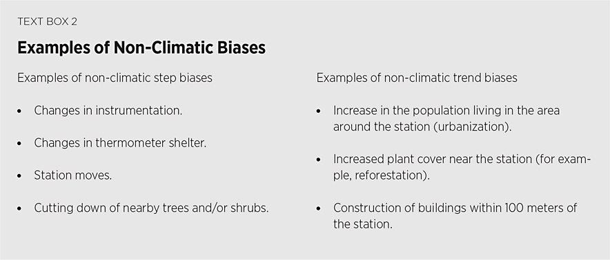
The term “step” means that the average temperatures will increase or decrease by some fixed value immediately after a local change. As discussed below, different research groups have tried to account for step biases by applying a variety of adjustments to stations’ temperature records. Less attention is given to the subtler trend biases that affect a station’s temperature record over time. The most significant trend bias is probably the urban heat island (UHI) effect: urbanization of the area around a weather station.
The Urban Heat Island Effect
It has long been known that urban areas tend to be warmer than their surrounding rural areas. Many reasons have been suggested to explain why this is so.">REF It is argued, for example, that:
- Natural soil surfaces are replaced by impervious manmade materials that more readily store heat from the sun.
- High-rise buildings can alter the wind flow and create canyon-like effects.
- Very high buildings could cause changes in the boundary layer.
- When rain falls in urban areas, it is usually carried away in drains; in rural areas, it soaks into the ground and later cools the ground by evaporation.
- Rural areas tend to have more plant cover, and sunlight that lands on plants is converted by photosynthesis into biomass instead of heat. Sunlight that lands on concrete, pavements, or rocks is converted into heat.
- Additional heat is added to urban areas just by an increase in human activity including vehicles, air conditioning, and machinery.
The urban heat island effect is a real but local manmade climate change effect. The more this “urban heat island” increases, the more urbanized an area becomes. If the area around a weather station becomes increasingly urbanized, the growing urban heat island introduces an extra warming trend to the station’s temperature records. This type of trend bias is particularly significant when analyzing global temperature trends for three reasons:
- Although urban areas occupy only a small percentage of the planet (less than 4 percent of the land area), most of the weather stations in the GHCN are in urban areas, as can be seen from Chart 1, which shows how the representation of urban versus rural stations in world thermometer records has changed from 1800 to the present.
- Most of the longest-running and best-maintained weather stations are in urban areas because of a readily available workforce.
- Generally speaking, urban areas are growing, and many weather stations that once were in rural areas are becoming increasingly urbanized.
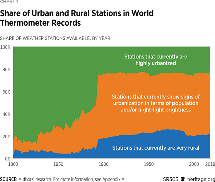
The IPCC claims that this type of non-climatic bias accounts for less than 10 percent of the global warming,REF and most groups studying long-term temperature trends have largely ignored the problem. However, it is a much greater problem than the IPCC claims.
Overcoming the Urban Heat Island Trend Bias
It is worthwhile to decouple temperature trends from the associated bias generated by the urban heat island effect. To address this goal, we developed a temperature trend estimate using only the data from rural weather stations and compared it to a temperature trend using data from both rural and urban stations. We carried out this analysis only for the Northern Hemisphere because there were not enough rural stations in the Southern Hemisphere to serve as the basis of a meaningful analysis. Rural stations were determined by population density and night brightness as observed by satellites; rural areas had a low population and low night brightness.
Chart 2 shows the average yearly temperature trends from 1880–2018 generated using data from all stations (both rural and urban) and a temperature trend over the same period but using only rural data. There are significant differences between the two temperature trends.
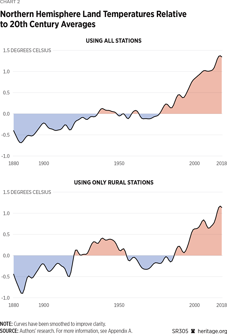
One significant difference is that when the temperature data from both rural and urban stations are analyzed together, it is concluded that there is an overall warming trend of 0.89°C per century. However, when only rural temperature records are analyzed, it is concluded that there has been an overall warming trend of 0.55°C per century, which is 40 percent less warming than from the combined estimate.
Another significant difference is that the rural station data show a cyclical pattern of warming and cooling periods every few decades since the late 1800s rather than the almost continuous warming trend of the standard estimates using both urban and rural data.
There is clearly a difference in the data being recorded in rural and urban areas. Since the rural temperature records are not affected by the urban heat island effect, the question then becomes whether rural temperature records are a better dataset for studying a global temperature trend.
To assess the accuracy of the rural weather station data, we compared them to other types of datasets recording temperature changes around the globe. We generated temperature trends using independent data from sea surface temperature datasets, tree-ring data, and glacier data and compared them to our rural temperature trend. Chart 3 shows the temperature trend estimates generated for the period 1880–2018 in the Northern Hemisphere using the various temperature datasets.
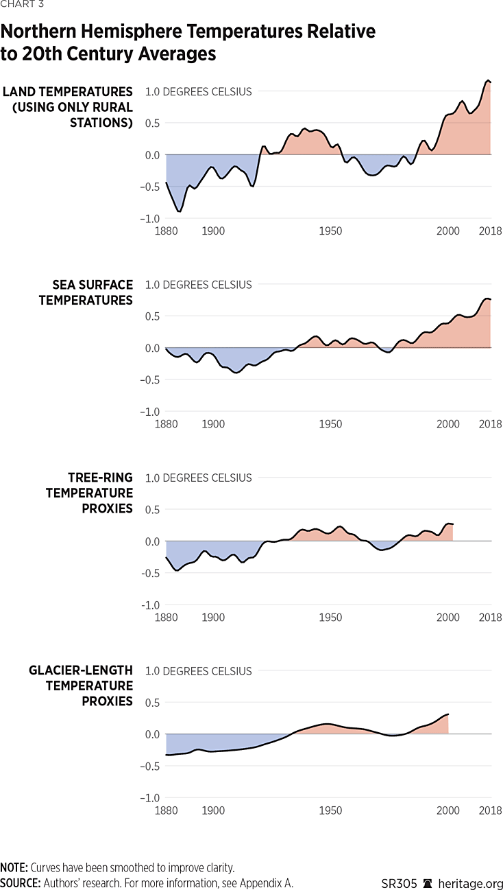
The rural weather station temperature trend compares well with many of these datasets. This result suggests that rural weather station data may be more accurate than the combined rural and urban weather station data as a representation of temperature trends in the Northern Hemisphere.
Combining Weather Station Measurements
When we were developing the rural-only temperature trends discussed above, we discovered two issues plaguing many of the global temperature estimates generated by other groups that do not seem to have been considered. These two issues are (1) inconsistencies in the current homogenization techniques that some groups have uncritically adopted in an attempt to correct for step biases and (2) urban blending.
Both problems arise from attempts to adjust the individual station records to account for the non-climatic step biases. These adjusted datasets are called homogenized datasets.REF NOAA supplies homogenized datasets and recommends them as the preferred sets for temperature trend analysis. However, these homogenized datasets have their own problems.
Accounting for Step Biases. Most groups constructing world temperature trends (including ours) agree that even though step changes are not a major concern for short-term weather predictions, they can be significant when estimating long-term temperature trends.
Our group’s approach to correcting for these non-climatic step biases has been, first, to find out whether there are any documented historical changes associated with each station (station history metadata) or any other relevant information about the station (for example, how urbanized it has become).
Station history metadata is information that is often kept by the operators of the weather station. This can include information about (among other things):
- Station moves and any parallel temperature records for the old location before it was decommissioned,
- Changes in thermometers, and
- Changes in the time of observations.
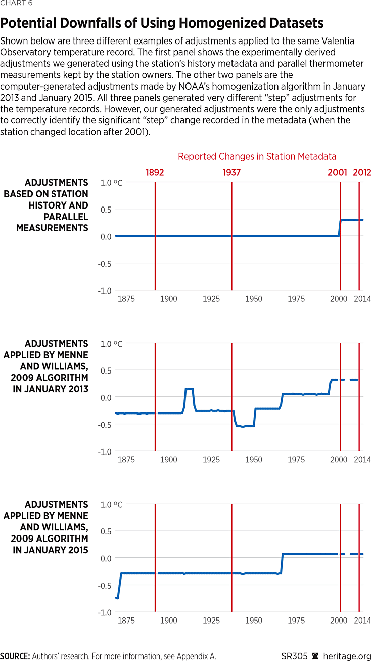
Chart 4 shows how we used the station metadata for the Valentia Observatory weather station in rural Ireland to homogenize their temperature records.
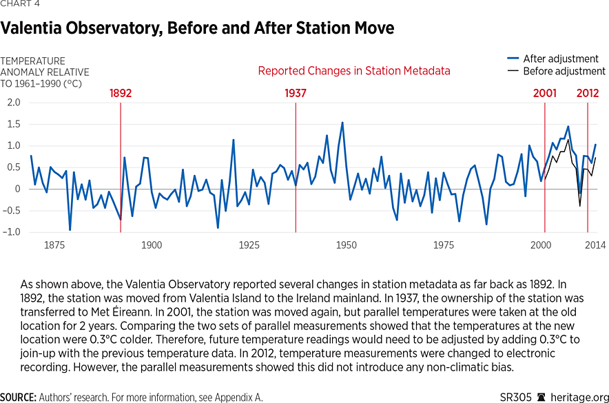
However, most groups apparently do not take this approach to correcting for non-climatic biases. Instead, they rely on computer programs to “statistically homogenize” the data without station history metadata, using only statistical comparisons of each station’s record to the records of its neighbors.
NOAA’s homogenized dataset is created using a computer algorithm developed by Matthew Menne and Claude Williams.REF This computer algorithm analyzes temperature anomalies (explained in Chart 5) and compares them to temperature anomalies in the surrounding area. If the anomaly value for one weather station is out of line with those of the surrounding stations, then it adds a temperature increment to or subtracts the increment from the station’s temperature record.
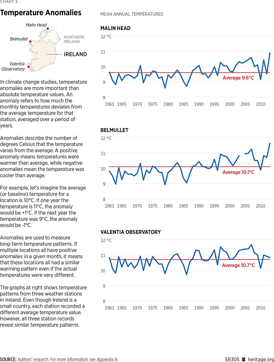
When we first started working on the rural temperature trend measurements discussed above for a paper published in 2015,REF we noticed two problems with NOAA’s computer-generated homogenized datasets:
- NOAA’s adjustments did not make sense for the Valentia weather station in rural Ireland because they did not correspond to the station’s metadata.
- We realized that the adjustments NOAA applied to the station record changed every day. We found that there was little consistency either between the adjustments in the various homogenized datasets themselves or between these adjustments and the station’s metadata. We found these inconsistencies disturbing. (See Chart 6.)
To figure out how systemic the two problems we found for the Valentia Observatory station record are, we published an extensive study in 2022 in which we analyzed more than 800 European station records.REF
A colleague, Peter O’Neill, had been downloading and archiving NOAA’s homogenized datasets for years. In collaboration with Peter and other international colleagues, we collected the metadata from more than 800 stations in 24 European countries. We compared the various adjustments in NOAA’s homogenized datasets with the corresponding metadata for each station. The results are summarized in Figure 1.
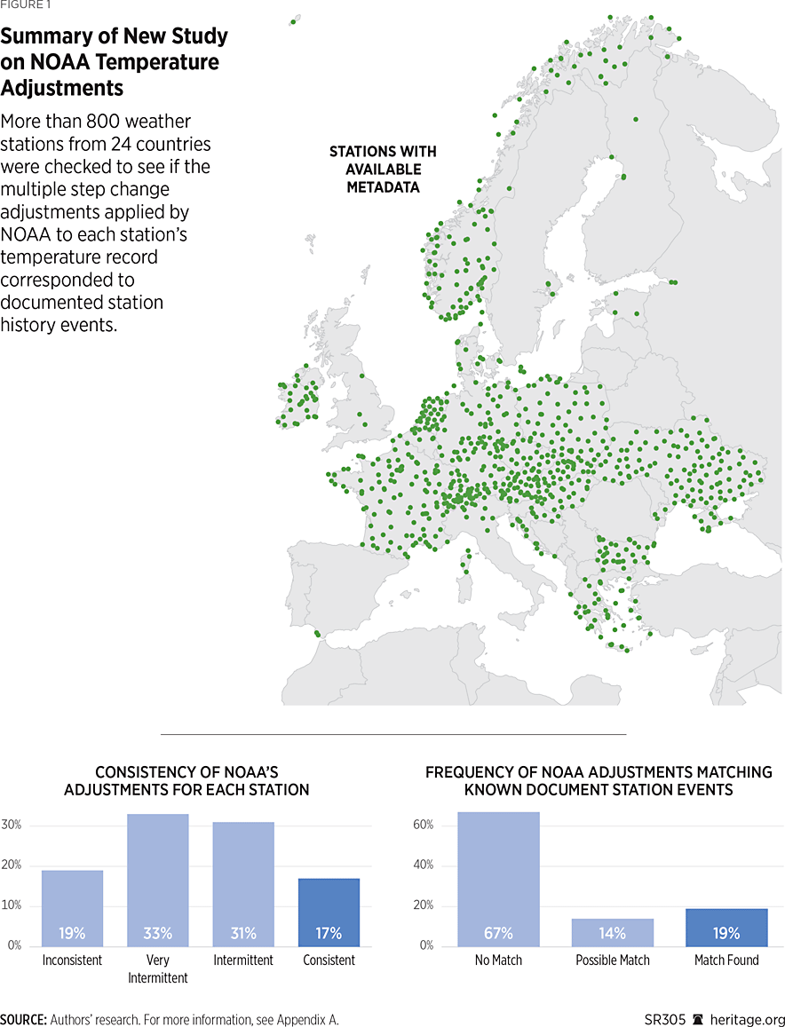
It is clear that using homogenized datasets presents several potential problems. The first arise from the fact that these datasets are remarkably inconsistent. They rarely coincide with documented non-climatic biases (recorded in the metadata), and any temperature trends published using an earlier homogenized dataset would have to be updated daily to be relevant to the current homogenized dataset.
However, while investigating these first issues with the computer homogenized data, we realized there was another problem with the computer-based homogenization algorithm. We call this problem urban blending.
Urban Blending. Urban blending occurs when there is a mixture of rural and urban stations in a weather station network. The non-climatic urbanization trend biases are different for urban, suburban, and rural stations. However, the current homogenization algorithms often use urban stations to check the biases in rural stations’ records and vice versa. The net effect of this is to transfer some of the urban warming into the neighboring rural stations’ records while also transferring some of the rural stations’ trends to the urban stations’ records.
Yu-Ting He and Gen-Suo JiaREF compared the temperature trends of 10 stations near Beijing, China, before and after their data had been homogenized. After homogenization, the most rural stations’ temperature records showed more warming than before homogenization, and the most urban stations’ records showed less warming. All of the homogenized data converged toward those of the moderately urbanized stations. The net result was a contamination of both the rural and urban homogenized datasets. This means that, because weather stations tend to be far apart from one another, this contamination can be affecting data collected hundreds of miles away.
Recently, our group published a new studyREF analyzing urban blending for two countries: Japan and the United States of America. For both countries, it was clear that the raw temperature data were contaminated with urbanization bias. However, the homogenized data introduced a different but substantial contamination due to urban blending.
In 2021, the IPCC published its Sixth Assessment Report, in which it claimed to detect unprecedented global warming and concluded that this warming must be almost entirely human-caused.REF For its climate change detection, the IPCC considered only the combined rural and urban global time temperature series based on homogenized datasets. Its justification for using the homogenized datasets was that it believed the algorithm dealt adequately with the non-climatic biases. The IPCC acknowledged the presence of an urban heat island problem but believed that this effect was small (less than 10 percent of the warming) and could safely be neglected. It does not appear to have considered either of the two problems with the current homogenization approaches: the unreliability of NOAA’s constantly changing homogenization adjustmentsREF and the urban blending problem.REF
Failure to address the urban heat island effect adequately, however, is not the only issue with the IPCC’s presentation of global warming. There are more fundamental issues at play with claims that are being made.
Should the IPCC Attribute “Unprecedented” Climate Change to Humans?
In this section we will explain the IPCC’s basis for attributing “unprecedented” global warming to human activity.REF We know from the urban heat island effect that human activity can cause local climate change: that is, that urban areas can become warmer than the surrounding rural areas, often by several degrees. However, it is important to ask whether there are any human activities that are affecting the world’s climate as a whole: for example, by resulting in human-caused global warming.
To investigate this question properly, we also need to determine how much of the current warming is due to natural phenomena. We know that in the past, long before humans occupied the planet, there were periods of very large changes in the world’s climate (for example, the different ice ages). Humans were not around to cause these various climate changes; instead, they were due to various natural phenomena. Some of the natural causes of climate change include:
- Changes in the Earth’s Orbit or Tilt. When the Earth’s orientation to the sun changes, this can affect the amount of sunlight reaching the Earth. Changes in the Earth’s orbit are widely believed to have caused the ice ages.REF
- Volcanic Activity. The dust cloud from the 1815 eruption of Tambora in Indonesia gave rise to what was called “the year without a summer” in 1816.REF
- Changes in Ocean Currents. Changes in the ocean currents caused by the El Niño–La Niña phenomena (an occurrence that typically happens every two to seven years) affect the global climate.REF They cause disruptions in weather patterns such as intense storms in some places and droughts in others. The yearly global temperature values increase significantly in El Niño years and decrease drastically in La Niña years. Thus, multi-decadal periods with more El Niño activity, for example, can cause temporary global warming.
- The Amount of Sunlight Being Emitted from the Sun. The amount of sunlight the sun emits is not constant. We can see examples of this by studying the changes in the number of sunspots and other magnetic structures/features on the sun. The number of sunspots can change quite substantially over an average cycle of 11 years. “Total solar irradiance” (TSI) is the term used to describe the sunlight (or energy) arriving at the Earth.REF
In order to investigate the causes of current global warming and attribute blame, the various computer modelling groups that contributed to the IPCC’s Sixth Assessment ReportREF ran computer model simulations of how the current models say global temperatures should have changed since 1850. They ran two key types of simulations—one using “only natural forcings” (by which they mean changes in TSI and volcanic eruptions) and one using “both natural and anthropogenic forcings” (in which they added their calculated greenhouse gas contribution).
Their simulations using “only natural forcings” were unable to explain any of the observed warming after the 1950s, but their other simulations could. This was their basis for claiming that the warming since at least the 1950s was mostly human-caused.
Chart 7 compares the standard temperature estimates using both rural and urban weather stations (in black) to the changes in TSI according to the estimate used in the IPCC’s Sixth Assessment Report (in orange). The energy from the sun does not appear to be influencing the observed global temperature trend.
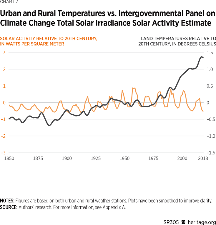
Looking at Chart 7, the observed warming cannot be explained by natural forcings. For this reason, the IPCC concluded that the observed warming must be almost entirely human-caused. However, having already discussed the problems involved with using the combined rural and urban temperature data, let us now examine some of the issues associated with the hindcast modelling and the TSI record that the IPCC used.
Limitations of the IPCC’s Attribution Method
Our research group has recently published two peer-reviewed papers investigating surface temperature changes in the Northern Hemisphere since the 19th century.REF Both papers demonstrate how easy it is for scientists to arrive at opposite conclusions about the causes of climate change. This is because the conclusions strongly depend on which TSI record, which temperature estimate, and which approach for analysis is used.
The hindcast models used by the IPCC considered only two natural forcings: TSI and volcanic. The IPCC acknowledges that there are limitations with the volcanic forcings data but ignores the difficulties associated with its chosen TSI dataset. There are many competing TSI datasets in the scientific literature, each implying a different history of TSI changes since 1850.REF However, the IPCC used only the Matthes et al. TSI time series.REF
In our studies, we did not use computer climate models. Instead, we used statistical fitting techniques. This allowed us to compare many different combinations of temperature estimates and different choices of TSI and other forcings. Unlike the authors of the IPCC’s Sixth Assessment Report, we were able to consider 27 different TSI records (including the one chosen by the IPCC). We discovered that the TSI record chosen by the IPCC happened to be one of the records that gave the lowest solar contribution to global warming.
In order to understand why this is important, it helps to have some idea of the difficulties involved in constructing a TSI dataset and why there are so many peer-reviewed TSI datasets in the literature. Constructing a TSI record involves at least two stages. One stage involves analyzing the direct TSI measurements from the satellite era (after 1978). The other involves using indirect estimates of solar activity called “solar proxies” to analyze the pre-satellite era (before 1978). The satellite portions of the TSI reconstructions are carried out using direct measurements of the sun taken above the Earth’s atmosphere by satellites.
For the pre-satellite era, solar proxies are used to capture important aspects of changing solar activity. Some of the proxies include sunspot numbers, group sunspot numbers, solar cycle length, and bright spots in the sun’s photosphere (called the solar faculae). To construct a TSI record for the pre-satellite era, solar proxies are calibrated against the measurements from the satellite era and converted into TSI values. However, besides the difficulties of deciding which proxy (or combination of proxies) to use for this calibration, there is also the problem of deciding which satellite measurements to use.
Since 1978, various satellite missions have monitored the TSI reaching the Earth. Unfortunately, each satellite mission lasts only a decade or so. Therefore, to study the changes in TSI over multiple decades, researchers need to combine the data from each mission into a continuous record. There are three problems associated with this blending of TSI data.
- Each satellite mission has given a different average TSI value,
- Each satellite mission implies slightly different changes in TSI over time, and
- There are some gaps in the data when there are not enough data.
As a result of this, rather than one satellite-era TSI record, there are multiple records, some of which reveal contradictory TSI trends. Chart 8 shows all of the TSI data recorded by each of the different satellite missions.
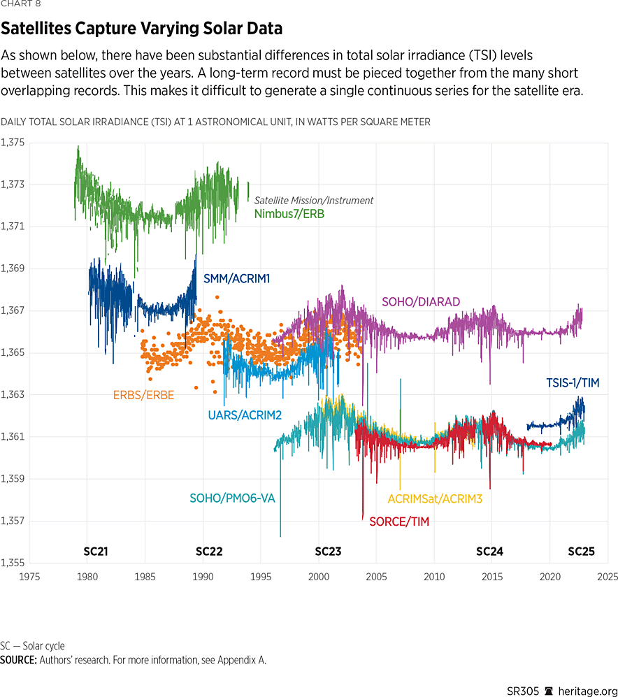
Much of the debate over the satellite TSI records is centered on what is known as the ACRIM (Active Cavity Radiometer Irradiance Monitor) gap. As a result of the Challenger space shuttle disaster in 1986, the launch of the ACRIM2 satellite (which had been planned to replace the ACRIM1) was significantly delayed. Therefore, instead of an overlap between the data from ACRIM1 and the data from ACRIM2, there was a gap in the measurements, and the question has been how best to blend these two records.REF
It has been suggested that the intensity of the debates over how to generate a continuous TSI record is more influenced by politics than it is by science. For instance, Pia ZachariasREF has argued that “[a] conclusive TSI time series is not only desirable from the perspective of the scientific community, but also when considering the rising interest of the public in questions related to climate change issues.” She argues that people might take advantage of these discrepancies within the TSI community to suggest that human forcings are not as significant as TSI forcings in causing climate change.
One may ask why the blended or composite TSI satellite records would be so critical to people’s perception of human-caused global warming. We recently published a comprehensive analysis of the TSI satellite data from 1978 to 2023 (Chart 8) and compiled 17 new TSI satellite composites records and 4 existing composite records.REF However, for simplicity, let us just discuss two of the main rival TSI satellite records: ACRIM and PMOD (Physikalisch-Meteorologisches Observatorium Davos). The ACRIM record implies that TSI increased until the end of the 20th century but has been decreasing ever since then; the PMOD record implies that TSI has been decreasing since the late 1970s. The ACRIM team chose to use only the satellite records recommended by the satellite mission teams;REF the PMOD team applied their own adjustments to several of the satellite records that significantly altered the TSI trends.REF If the ACRIM dataset is correct, then it suggests that a lot of the increase in global temperatures during the 1980s and 1990s could have been due to increases in TSI. However, if the PMOD dataset is correct, then it implies that none of the observed warming since the late 1970s could be due to TSI.
Meanwhile, the solar proxies that match best to PMOD suggest that TSI has not changed much since the 19th century and, if anything, peaked in the 1950s. On the other hand, the solar proxies that match best to ACRIM suggest a more dynamic sun and a much greater solar contribution to global warming since the 19th century.
In this way, the simple choice of which TSI satellite record to use for your analysis can substantially influence how much climate change you attribute to human versus natural forcings. The IPCC used a PMOD-calibrated TSI record for its analysis. (See Chart 7.) However, Chart 9 shows a different analysis.
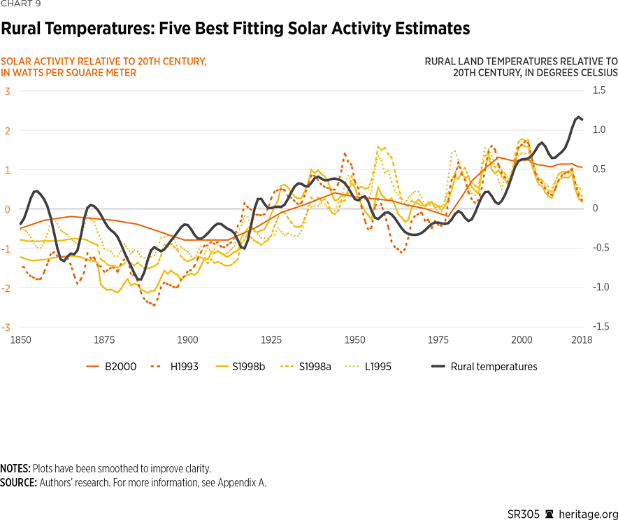
Rather than using an approach like the IPCC’s and considering only one TSI estimate, we repeated our analysis 27 times, each time using a different TSI estimate. Some TSI estimates, including the “Matthes et al. 2017”REF estimate used in the IPCC’s Sixth Assessment Report, were unable to explain many of the temperature changes since 1850; other TSI estimates suggested anything from a substantial role for the sun to a major role for the sun.
In Chart 9, we compare our rural-only temperature estimate (in black) to the five best-fitting TSI estimates (in orange) out of the 27. Interestingly, all five of these estimates were ACRIM-calibrated. This comparison suggests the exact opposite of the IPCC’s conclusion: Specifically, it suggests that most of the warming (and cooling) periods since the 19th century could be due to changes in the sun’s activity.
In an article published in Research in Astronomy and Astrophysics in 2023,REF we expanded this analysis to consider all five of the temperature estimates we saw in Charts 2 and 3 and all 27 different TSI records. We found that, depending on which TSI record we consider, we can explain anything from most of the warming to none of the warming as being due to changes in solar activity. For the non-urbanized temperature data, we found that the best-fitting TSI records provide a better match to the temperature changes than the IPCC’s proposed human-caused factors provide.
In our opinion, the scientific community has not yet satisfactorily established which TSI estimate (if any) is correct. These scientific debates are still ongoing. For instance, one scientist recently published a studyREF disputing the validity of the “H1993” estimate in Chart 9, but this has also recently been countered in an online analysis.REF
Conclusion
The purpose of this report is to highlight the wide range of scientifically valid but contradictory conclusions that can be drawn from the various methods, procedures, and datasets that are used to study long-term global temperature trends. Despite the confidence with which the IPCC claims to have “settled the science” around the detection and attribution of climate change, this challenging scientific debate has not yet been satisfactorily resolved.
We think that the IPCC did not provide a strong enough argument for its choice of the available global temperature trends. We have concerns about the urbanization bias contaminating urban weather station data and the urban blending contaminating homogenized temperature datasets. The IPCC claims that urban warming is only a small part of the observed warming, but our studies suggest that urban warming is a substantial part of the warming in the current global temperature estimates. We propose as a first step solution to develop a temperature record that considers only rural thermometer stations. Our published rural record suggests that the IPCC’s temperature estimates might have up to 40% extra warming due to urban bias and flawed homogenization.
We also have concerns about the IPCC’s handling of the ongoing scientific debate over the changes in solar activity (TSI) since 1850. The TSI estimate used by the computer model simulations that contributed to the IPCC analysis was guaranteed to show that global warming was “mostly human-caused.” However, we have identified at least 27 different estimates of the changes in TSI since 1850. Several of these estimates suggest that global warming is “mostly natural,” and several suggest that global warming is a mixture of natural and human-caused factors.
We therefore conclude that the IPCC was overconfident and premature in its detection and attribution statements. The scientific debate remains ongoing. In our opinion, the scientific community is not yet in a position to establish whether the observed temperature changes since the 1800s are “mostly natural,” “mostly human-caused,” or “a mixture of both.”
The scientific debate about how much global warming is manmade and how much is natural has not been resolved. We hope that in its Seventh Assessment Report, the IPCC will not continue with its scientifically weak approach.
Willie Soon, PhD, is Co-Team Leader of the Center for Environmental Research and Earth Sciences (CERES) and Visiting Scientist at the Institute of Earth Physics and Space Science. Ronan Connolly, PhD, is Co-Team Leader of the Center for Environmental Research and Earth Sciences (CERES) and an independent scientist, environmentalist, and writer. Michael Connolly, PhD, is Co-Team Leader of the Center for Environmental Research and Earth Sciences (CERES) and an independent scientist and environmentalist.
Appendix A
Map 1
U.S. Department of Commerce, National Oceanic and Atmospheric Administration, National Centers for Environmental Information, “Global Historical Climatology Network–Monthly (GHCN–M), Version 3,” May 2011, https://www.ncei.noaa.gov/access/metadata/landing-page/bin/iso?id=gov.noaa.ncdc:C00839 (accessed November 7, 2024).
Chart 1
U.S. Department of Commerce, National Oceanic and Atmospheric Administration, National Centers for Environmental Information, “Global Historical Climatology Network–Monthly (GHCN–M), Version 3,” May 2011, https://www.ncei.noaa.gov/access/metadata/landing-page/bin/iso?id=gov.noaa.ncdc:C00839 (accessed November 7, 2024).
Chart 2
Ronan Connolly, “Supplementary Materials for ‘Challenges in the Detection and Attribution of Northern Hemisphere Surface Temperature Trends Since 1850’ [Data set],” Zenodo, August 18, 2023, https://zenodo.org/records/8225275 (accessed November 7, 2024).
Chart 3
Ronan Connolly, “Supplementary Materials for ‘Challenges in the Detection and Attribution of Northern Hemisphere Surface Temperature Trends Since 1850’ [Data set],” Zenodo, August 18, 2023, https://zenodo.org/records/8225275 (accessed November 7, 2024).
Chart 4
Ronan Connolly, “Re-evaluating the Role of Solar Variability on Northern Hemisphere Temperature Trends Since the 19th Century—Supplementary Information,” Figshare, Software, https://doi.org/10.6084/m9.figshare.4879490.v1 (accessed November 7, 2024).
Chart 5
1. Ronan Connolly, “Re-evaluating the Role of Solar Variability on Northern Hemisphere Temperature Trends Since the 19th Century—Supplementary Information,” Figshare, Software, https://doi.org/10.6084/m9.figshare.4879490.v1 (accessed November 7, 2024).
2. U.S. Department of Commerce, National Oceanic and Atmospheric Administration, National Centers for Environmental Information, “Global Historical Climatology Network–Monthly (GHCN–M), Version 3,” May 2011, https://www.ncei.noaa.gov/access/metadata/landing-page/bin/iso?id=gov.noaa.ncdc:C00839 (accessed November 7, 2024).
Chart 6
Ronan Connolly, “Re-evaluating the Role of Solar Variability on Northern Hemisphere Temperature Trends Since the 19th Century—Supplementary Information,” Figshare, Software, https://doi.org/10.6084/m9.figshare.4879490.v1 (accessed November 7, 2024).
Figure 1
1. U.S. Department of Commerce, National Oceanic and Atmospheric Administration, National Centers for Environmental Information, “Global Historical Climatology Network–Monthly (GHCN–m), Version 3,” May 2011, https://www.ncei.noaa.gov/access/metadata/landing-page/bin/iso?id=gov.noaa.ncdc:C00839 (accessed November 7, 2024).
2. Peter O’Neill et al., “Supplementary Materials for ‘Evaluation of the Homogenization Adjustments Applied to European Temperature Records in the Global Historical Climatology Network (GHCN),’” Atmosphere, Vol. 13, No. 2 (February 2022), https://www.mdpi.com/article/10.3390/atmos13020285/s1 (accessed November 7, 2024).
Chart 7
Ronan Connolly, “Supplementary Materials for ‘Challenges in the Detection and Attribution of Northern Hemisphere Surface Temperature Trends Since 1850’ [Data set],” Zenodo, August 18, 2023, https://zenodo.org/records/8225275 (accessed November 7, 2024).
Chart 8
1. U.S. Department of Commerce, National Oceanic and Atmospheric Administration, National Centers for Environmental Information, “Total Solar Irradiance (TSI),” https://www.ngdc.noaa.gov/stp/solar/solarirrad.html (accessed November 7, 2024).
2. Richard C. Willson, “Total Solar Irradiance Monitoring,” Active Cavity Radiometer Irradiance Monitor, updated April 2013, https://web.archive.org/web/20170209124046/http://acrim.com/ (accessed November 7, 2024).
3. U.S. Department of Commerce, National Oceanic and Atmospheric Administration, National Centers for Environmental Information, “Total Solar Irradiance (TSI),” https://www.ngdc.noaa.gov/stp/solar/solarirrad.html (accessed November 7, 2024).
4. Copernicus Climate Change Service, “Daily Total Solar Irradiance (TSI) Timeseries,” January 17, 2024, https://gerb.oma.be/tsi/C3S_RMIB_daily_TSI_composite_ICDR_v3.1.txt (accessed November 7, 2024).
5. W. Finsterle and J. Montillet, “Solar Constant: Construction of a Composite Total Solar Irradiance (TSI) Time-Series from 1978 to the Present,” Physikalisch-Meteorologisches Observatorium Davos/World Radiation Center, updated February 2022, https://www.pmodwrc.ch/en/research-development/solar-physics/tsi-composite/ (accessed November 7, 2024).
6. University of Colorado at Boulder, Laboratory for Atmospheric and Space Physics, Solar Radiation & Climate Experiment, “Total Solar Irradiance Data,” data from February 25, 2003, to February 25, 2020, http://lasp.colorado.edu/home/sorce/data/tsi-data/ (accessed November 7, 2024).
7. University of Colorado at Boulder, Laboratory for Atmospheric and Space Physics, Solar Radiation & Climate Experiment, “Total Solar Irradiance Data,” data from February 25, 2003, to February 25, 2020, http://lasp.colorado.edu/home/sorce/data/tsi-data/ (accessed November 7, 2024).
Chart 9
Ronan Connolly, “Supplementary Materials for ‘Challenges in the Detection and Attribution of Northern Hemisphere Surface Temperature Trends Since 1850’ [Data set],” Zenodo, August 18, 2023, https://zenodo.org/records/8225275 (accessed November 7, 2024).


